If I wrote everything is on my mind right now, I’d keep going to only re-emerge in a week. But since it’s utterly pointless, I’ll try to be done with quickly, enough so it can be off my mind.
Topic is that I’m starting to see why Scott Bakker left the scene. Not as an active author, but in the general, wider “discourse.”
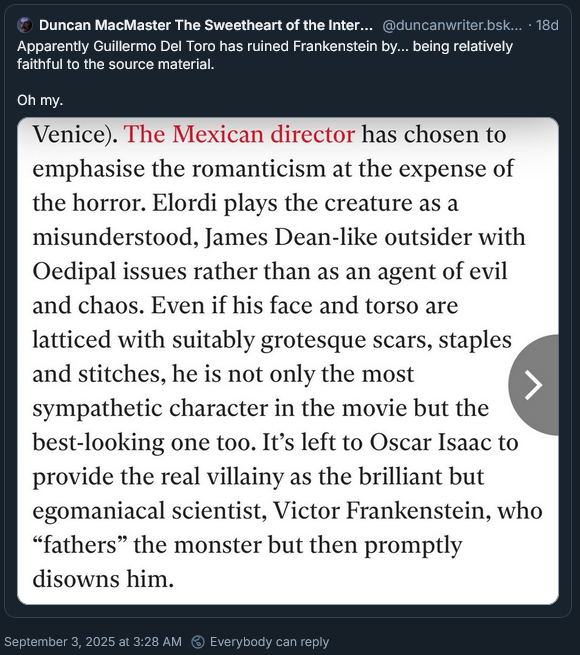
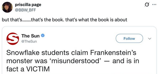
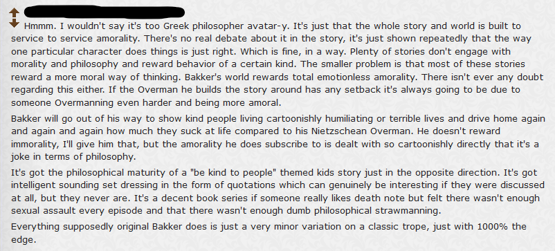
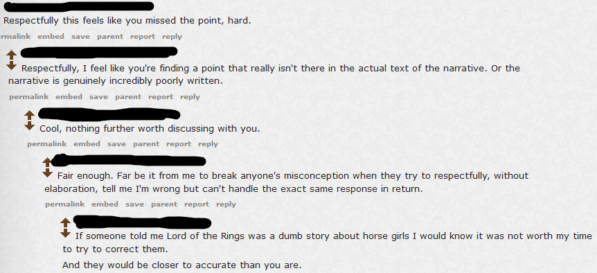
It looks like there’s a (still, ongoing) legion of shitposters hellbent on this type of nonsensical propaganda:


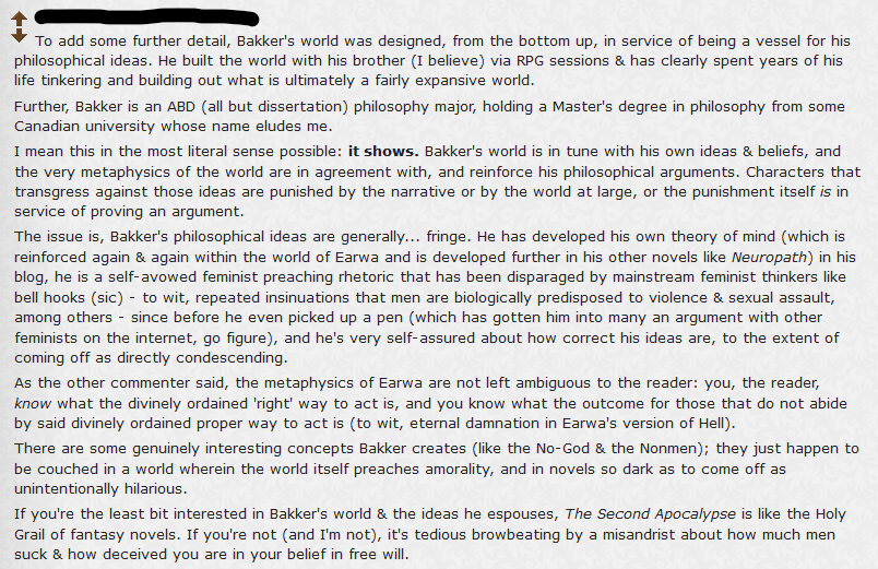
(by the way, “Bakker is an ABD” is quite a telling sign someone happily loving the taxonomy of placing people into neat convenient boxes, and being complacent about knowing the world thus, it indeed “shows”)
Not the kind of shitposters writing casually and moving on. These are quite elaborate, requiring some effort. From an unbiased, third party point of view these read as quite reliable information. On point. Reading these without context I’d far more lean to accept and believe them, compared to a “defense” written by what would look mostly likely as a “fanboy.”
What I mean is that if I stumbled on these kind of posts, I personally would have leaned to believe them. They’d contribute meaningfully to paint the picture. Position the author, while considering what to read and what to skip, given that you have to decide what to give your attention to, before doing it.
This is interesting to me because not long ago I stumbled on a similar type of shitposting, but with Erikson as the target. And so I felt like I had to polish my own weapons and come to Erikson’s defense. You know, to preserve the “honor.” But what’s curious about this last example is that the shitposting came from someone who was disparaging Erikson’s work, while being deeply enamoured of Bakker. So he could see that worthwhile, engaging philosophical research in Bakker, but Erikson had none. Philosophy with the depth of a puddle. Childish pretense. Exaggerations and fireworks for the easily impressed.
Now we have a schematically third group where it just happen to be Bakker targeted as the undergraduate wannabe armchair philosopher edgelord. Stubbornly fretting to get attention for his naive, “fringe” ideas. (totally inexplicable to me, the second commenter shown there, taking an hardcore shit on Bakker, appears to be a fan of Malazan instead…. just HOW?!?)
So I’m here just as another partisan? What box I belong to? Is it just a game of factions? Are we just switching masks and taking turns?
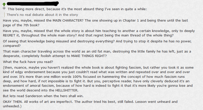
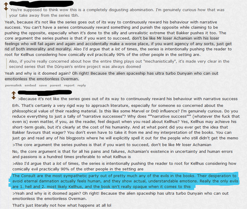
Because I do THE EXACT SAME THING: (second one is me)

But then, I do have no idea how to get deeper, there. I’ve written endlessly about it on the blog, done tons of research, and spoken in various occasions, along the years with accomplished, actual philosophers and scientists. Pretty much at every occasion I had available. My own position is always in doubt, but it didn’t move because I only kept receiving conformations. To this day, I have not found a SINGLE, TINY idea or concept challenging my own initial stance.
And so, within the uncertainty of the point of view, I go claim a certain certainty in the comment I write. It’s backed off:
the criticism about Ted Chiang is ADAMANTINE, because of how deep to the core it is. That criticism DEMANDS to be as strong as possible. In a world where anti-vax propaganda becomes mainstream, where the government tells you to “not trust the experts, it’s not science.” Or worse, “trust your feelings.” Epistemology becomes the very core that is under active threat. So we get at what is philosophy, and what is science. And the story we tell ourselves about the very concepts of science and philosophy.
In Ted Chiang’s story the idea is a character receiving visions from the future, eventually “choosing” to make them true because life is worth living. Similar to the moral dilemma of deciding to have a baby, rather than abortion, knowing the baby has some birth defect. In the end the acceptance for the world as it is wants that love embraces it all. So, in the context of Arrival, it means acceptance of what’s to come, even in the possibility (or certainty in this case) of illness and death. In the end love embraces all, and pushes the hard sci-fi story to its more relatable and human level that people appreciated.
But that’s not science. We have this totally false and misleading idea that a scientist is a person who has one crazy intuition one day, then spends the rest of his life trying to prove it. So that he can finally be vindicated. Maybe after a whole life struggling against institutions who constantly tried stopping them. But that’s again not science, or how a real scientist behaves. Science is not some unerring belief to get eventually vindicated, it’s the very opposite. A scientist with a theory is someone who will try to fight that theory, test it. Stress it, break it. The real, fundamental quality of a good scientist, especially when facing claimed certainty, is to be contrarian, SKEPTICAL. Meaning that a scientist who receives a “vision from the future,” postulating that this vision predicts precisely what will happen, and nothing can contradict it. Well, this scientist newfound REASON OF LIFE will be to PROVE THIS VISION WRONG. The scientist earnest reaction to some vision of the future is to make his life’s purpose to contradict it in every way possible. TO CHALLENGE IT. Because in the end the true nature of a scientist is not embracing something received, to never question it. That’s faith.
Ted Chiang, then, writes a story where it seems there’s a theme of science, but in the end it’s just faith being disguised. It’s rhetorical, false, manipulative. Resorting to the very old trick of using emotions and “love” in order to persuade the audience of its lie. EMBRACE THE LIE. As Bakker would say:
“All things both sacred and vile speak to the hearts of Men, and they are bewildered. Holding out their hands to darkness, THEY NAME IT LIGHT.”
Last few days I picked up The Name of the Wind by Rothfuss, a book I bought at the dawn of the universe but only got to page 60, a couple different times. This time it’s part of a different “project” and I’m currently at page 130. I enjoyed the beginning more than I expected, I think it was quite flawless. It has some well written endearing prose, occasionally even showing some glimpses of genius. But the honeymoon only lasted some 20 pages, because then it settled for a more straightforward style. But I still enjoyed what I was reading. And then I got to this line:
“That’s how I like to remember them today.”
To me, that was a very explicit message, and so I thought, “okay, his parents are dead next chapter.” But instead the story continued exactly as it was. Until those parents indeed died, just a few chapters later. It could have been seen as some clever, ominous foreshadowing, throwing that line there, then let the reader immerse again in the story and forget about it. But nope, because before the end Rothfuss repeats the same another TWO TIMES. Just to make sure you didn’t miss or forget the cue.
There is a big problem with all this, and why I wrote in my commentary that there’s a problem when you polish something too much: it becomes straightforward and artificial. The problem with this story, specifically, is that everything is perfect. Kvothe is a perfect child, obedient, studious, naive at times in an endearing way, but always smart, his parents are perfect, supporting, full of love for each other, unsurpassed artists in their own craft. And when Kvothe is given a tutor, he’s also perfect, himself too supportive, insightful, utterly dedicated and so on and so on. This is fine because both story and context are quite richly written and described. But it all falls apart because as a reader I was perceiving a very glaring, deliberate skeleton: it was all made so bubbly and nicely colored in order to set up the following drama. It’s all artificially inflated “goodness” just to take it away abruptly. Just so to pull on the reader’s emotional strings, trigger that reaction, and so establish a stronger connection with the dear poor boy main character.
All this fails for me as a reader because it all feels so impossibly forced and artificial. It even loses the little nuance that was here and there in the pages. All blown away because in the end it’s all meant as a giant lever to pull you in a determined direction. It’s a mechanism. And it is quite pointless to me.
My reaction, having read all that, was: ok, this prologue ends at page 130, let’s read something else.
This type of story doesn’t really say anything of value to me. It’s just repetition of something I’ve seen. Even The Wheel of Time first book starts canonically in a corner of the world with a farmboy caught in his own daily wife, stuck in a small village, until suddenly a raid of evil creatures comes to upset the norm. Kvothe’s story is just the same, but with even LESS subtlety. It’s more interesting to read, page by page, because of different context, but it also ends up being framed even more bluntly to fit the intended purpose.
In the end, after 130 pages I’m left with absolutely nothing, outside of the enjoyment while reading and turning the pages. Robin Hobb is not dissimilar. Some excellent prose and resorting to cheap emotional tricks (bad things happening to innocent puppies, THREE TIMES within 100 pages). But the story does not end there. It’s not the point. Characters go somewhere, they leave you with something, whether you read 50 pages or the whole book. It’s not just an emotional GOTCHA, it’s not just set up. There is a substance that makes the reading engaging and entertaining, but without feeling completely pointless in the end.
But we started from Bakker here, and the point is you can’t misunderstand Rothfuss’ work: he already smashed your face to pieces with a bat.
There are some redeeming aspects to it. There is still a framing device, the story is told by Kvothe himself, unreliable narrator and all of that. It does make sense that he would give personally that angle to his story. So it is somewhat contextually justified, even if it does feel quite opportunistic as an excuse. The unreliable narrator is also blown out of proportion as we’ve seen already in the first few pages Kvothe being an extremely competent fighter. Actually, inhumanly so. That’s not the contained story, that’s authoritative omniscient. Unless the whole book is unreliable, and so you can as well toss it to the wall… (there would be more to discuss about unreliable narrators, including Gene Wolfe’s work, and how it became a silly excuse for everything)
There’s that, and then we return to Bakker. And to my own replies.
Spoiler-free, in what is a recommendation thread with someone asking reading suggestion about fantasy-philosophical book (I really don’t know how you can avoid mentioning Bakker or Erikson).

Here I can add:
1- That metaphysical certainty mentioned doesn’t appear until the last few pages of the very last book (inverted fire, never mentioned even once, afaik).
2- It’s an ALIEN artifact that almost no one knows exists, and those who have seen it are, like, less than an handful. Mostly off-screen characters. Its existence is almost completely external to the story, until the very few last pages.
3- It’s just about as saying: kings will enslave the population, to make their own bidding (referring to this particular class of gods and what they use to do).
Is that third point a certainty? Well, it goes without saying. In Bakker’s story it’s just another layer. It’s metaphysically true merely because no one has even attempted to challenge that layer. It BARELY appears in the books, which is why I strongly criticized the whole thing. It’s very incomplete. Especially if you want to question those “upper structures” that never really come into focus.
But how the hell can you take all that, which is some very advanced, extraneous discussion and use it to claim there’s no ambiguity to it when it is the one thing we can argue endlessly as it was left utterly incomplete? Not only itself is left ambiguous at the END of the series, when it surfaces. But through ALL SEVEN books is the very thing that fuels the ambiguity that rules everything. Otherwise why even read seven books?
Have you actually read the pages or just cobbled together comments from some shitposters? Because it all a clump of imprecise hearsay. None of it applies to the books at their surface level, to not even consider any deeper current.
Up to that point the concept of hell is literally equal to the religious concept in our own world. You do bad deeds = go to hell. And yeah, the people in the books BELIEVE that, go figure…
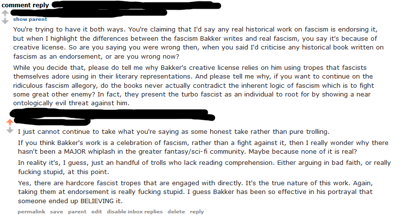
The other commenter being just an even more typical troll. To me the point was just nailing it to the point, without wasting more time.

And.

This guy was somehow caught up because I said that thinking Bakker endorses fascism is like taking an historical book about fascism and thinking it endorsement. But for this guy an accurate depiction of fascism would be impossible to mistake, because fascism has been clumsy and just the result of happenstance. Which is somewhat true. But for some reason he considered that aspect as some sort of “contradiction.” Because if Kellhus is incredibly competent, rather than clumsy, then he cannot impersonate any REAL fascism. Because, again, accurate fascism is clumsy.
And then, if you strengthen your villain (it’s a fantasy story, so you can) then, somehow, it becomes unambiguous ENDORSEMENT of fascism. Because it’s not anymore weak and faulty. Therefore “you’re contradicting yourself, can’t have it both ways.”
Huh? The line of distinction between fascism and everything else is not its clumsiness. Sure, there can be a certain correlation between being fucking stupid and being fascist, but it’s not how the concept itself is built and exists. There can be both very competent and ruthless fascism, as there can be clumsy, ridiculous fascism. They don’t overlap in a way they contradict each other as concepts.
The fact that Kellhus is “competent” doesn’t undermine the fact he can be a fascist. And the fact that he’s depicted as a very competent, effective fascist doesn’t undermine the fact he’s depicted AS A VILLAIN (or rather, an actual monster). Nope, for this guy the villains HAVE TO BE BUFFOONS. Tripping on each other feet, making themselves ugly and ridiculous. Because if you don’t do that, AH, you’re showing them as heroes. You are applauding fascism. It’s a celebration, right?
And we’re here in the greater discourse. Because all this appears as a very silly, forum-warrior kind of utterly pointless debate. But we’re here, in the greater world. The epistemology crisis that is shown by Bakker, now real. People will just flip any concept. Is Trump doing a fascist power grab and destroying humanity, or he’s the anti-establishment who’s giving power back to the people? Actual people will continue to flip. Factions. Boxes. Colors. Blue or Red. Democrats or Republicans. Flip. We are the rebels, you are the empire. Immigrants becoming invaders. Empathy becoming weakness. Strength becoming righteousness. This has no end.
It’s actually true that “trust the experts” is not science, as RFKJ says, but as a statement it’s left incomplete: THEN WHAT?
THEN WHAT?
If you don’t trust the experts, THEN WHAT?
No, you can’t judge and decide by yourself, especially to use it as a recommendation given to everyone, because you can’t be a fucking expert of everything. You aren’t smart enough, you don’t have enough time. You can’t study everything at once. You’re not Kvothe.
THEN WHAT? Trust the most stupid humanity has produced? The most delusional? The most certain of their own bullshit?
Why it is that those who wouldn’t trust the experts are usually the MOST CERTAIN of the baseless bullshit they preach? Have you ever seen one of those conspiracy theorists against the establishment ever call for skepticism and doubt, or rather just use them as weapons against mainstream claims, only to resort to absolute faith when it comes to sell their own bullshit?
Just flip around the truth, any convenient way.
We can get rid of the Trump, Musk and Putin quite easily. People occasionally get ill and die, it just happens. But it would be just a delay because the system is rigged. We don’t have a problem with individuals happening to be especially greedy and soulless. It’s just humanity being broken. This system of democracy works on the very premise of rhetoric and simplification. The moment you add complexity and nuance, you’re out. The system is SEALED SHUT. You can’t change it because the means to do it filter out any possible transformative action. Same as in Bakker’s books the attempts to prevent the Apocalypse SET IT IN MOTION.
You can make a valid criticism of Bakker, that it’s just five ideas and he spends 1 million words just to repeat, over and over, hammering them down. The same five ideas, over and over. But there’s some actual complexity of the real world there, some nuance, and so people just as easily misunderstand the whole thing. So what you do? What you do if you SHOUTED RIGHT IN THEIR EARS, but they got absolutely NOTHING.
How do you fix this when there’s such a radical, deliberate misunderstanding?
And so.

YES, because the point is not FLATTERY. It’s not Kvothe. It’s not a Mary Sue. When I say that Achamian is Bakker it’s not because it’s a show off. Bakker deconstructs, mocks and destroys HIMSELF. It is why this work has a ring of truth. It’s not a glorious celebration. It’s a deconstruction of everything, a scarification. Bleeding out.
This commenter seems to believe that there’s an absolute rule so that evilness is always clumsy, and morality always comes out winning and beautiful. If it’s not, then it means the author sided with the bad guys. If you are a cynical pessimist, then it means you love negativity. You can’t criticize the world for what it is.
The book doesn’t have an happy end? Well, the author must be amoral then.
Bakker did not step up on a pedestal to dispense his lessons. That’s Kellhus, a false idol. If you haven’t understood this, what the fuck have you read?
In the same way we have anti-vaxxers thinking themselves cleverer than everyone else, here we have a reader with zero reading comprehension, therefore deducing the book and author are childishly stupid. It simply follows.
(there’s more complexity to Kellhus, but we’re light years from this level of discussion. And even if we were to have it, it’s all quite uncertain because that whole layer is left incomplete in the story, and I complained about this at length)
But, you know the pattern: we can just flip it. I’m not some self-declared insightful reader, from the unbiased outside I’m just a fanboy.
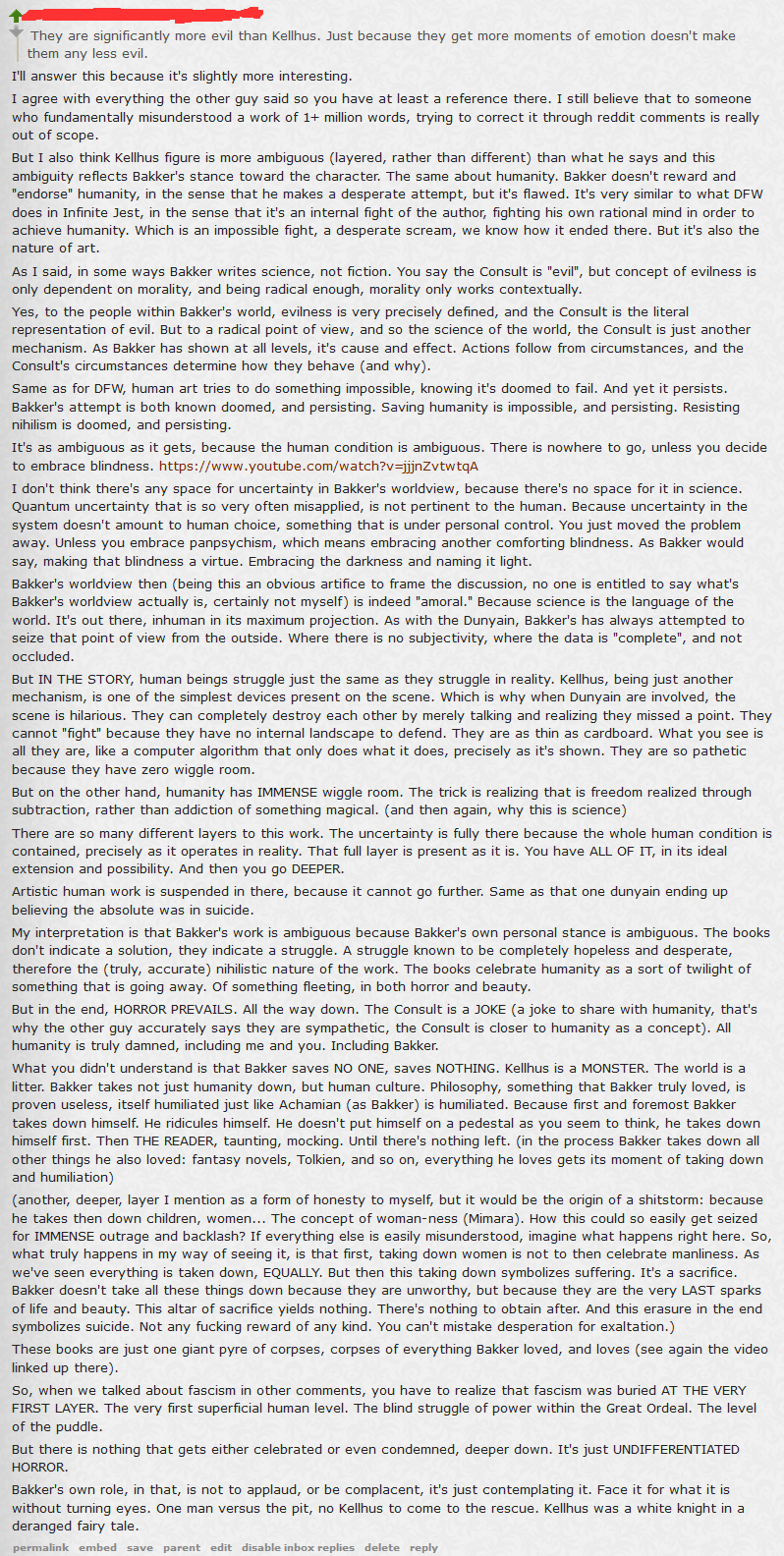
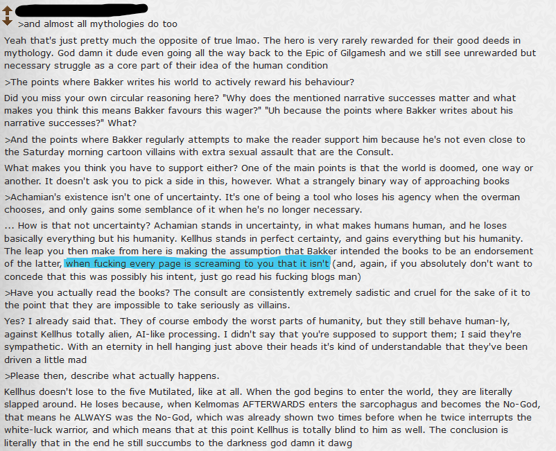
Thankfully a couple others ended up commenting.
This one is funny:

The rest, I wholly agree with:


(highlight mine)

(about that very last bit, since I didn’t get to comment as I intended to do… According to the most currently plausible fan theories, given all we know, Kellhus is very likely not dead. At least if he didn’t deliberately decide not to use one of countless, literal, aces in his sleeve. Or more precisely, attached to his belt…)
Everything written there is correct, but it’s still also a surface layer. If we really were to embed the level of Bakker’s blog here… Well, humanity itself would get questioned, rather than simply “endorsed.”
Also the fact, back to the book, that Kellhus is somewhat “right”, given the context, enables an unfathomable level of moral ambiguity, right at the center of the whole work. So it’s really quite “impressive” to claim there’s none of it.
Should I remind this was a recommendation thread? In my own personal experience, I’ve got far more useful information about a book I was going to read, more from the fanboys than the naysayers. You either connect or not with some work, but if you do, there is something. It just can not be not there. Maybe not for you. Just yesterday I was going through some videos of this guy: https://www.youtube.com/@SamHarrison2099
You could say he’s a Sanderson – Wheel of Time – Wandering Inn fanboy. The Wandering Inn, with its own 14 MILLION words. That’s correct, close to 15 now. To not even talk of the somewhat now popular subgenre of “progression fantasy”, or “cozy” fantasy. You have to draw the line somewhere. Something HAS TO BE SHIT, right?
If you can’t see any value in them, well, I’m sorry for you. We are all partial and incomplete, holding different pieces of the world. Rather than trying to deny what other people claim to have, worry about what you’re holding.
(Me? I’m anxiously waiting for Schattenfroh, that I had to preorder through a juggling of online sites to assure it comes as fast as possible. In October there’s latest Thomas Pynchon, Shadow Ticket, and early next year comes out William Vollmann’s magnum opus. Give me $150 to buy it, thank you. When you look at me, I guess, you have to LOOK UP. And squint.)
