I was looking at Subterranean Press limited editions of the Malazan books and being quite disappointed at the art there. But then I always am with that sort of stuff.
For fun I decided to describe what I’d instead put on the covers. I’m not an artist, but this is the sort of stuff I see in my mind and that I think would look great. Obviously just the first five books, because I’ve still to read the rest.
1- Gardens of the Moon. Well, Pale. Camera at the ground level, bottom up. You see at a distance Pale’s high walls, enough to give the walls some details and impressive scale. The cover should have a sense of verticalness to it. So the eye is drawn right at Pale’s walls, imposing, going upward. But then the impressive vista should escalate in scope as hovering above Pale you have Moon’s Spawn, maybe very slightly askew. So no characters on the cover, just a wide view of the scene, to focus on scale and scope. It should give a sense of disproportion, as if you cannot give a proper size to the elements in respect to each other. Sense of wonder.
2- Deadhouse Gates. Chain of Dogs. I’d go with top down, a look at a valley far below from an high point, the Chain of Dogs going through it. Not close enough to really detail people, just again giving a sense of scale at the long trail going through the dry land. Capemoths and stuff. Warm colors along with a sense of bleakness in the environment. Could even play with dust forming up a skull-like shape, in the background, but very subtle.
3- Memories of Ice. Just Kallor on his throne of bones, right in the center of the cover, arms open wide, hands too, but relaxed, as in welcoming. The layout should have a sort of curve to it. So that Kallor is almost facing the center of the cover, while the bottom part of the cover is through a top down angle. In this part, the three gods. K’rul in the center (bony, accusing finger pointed at Kallor), Draconus on left (I can’t remember if he has the sword already, if he does, let it drag behind, like a sack barely held by one hand), Nightchill on the right. All facing away, toward Kallor, from this slightly top down perspective to give the image some depth. The cover should be black & white (I’d love a strict ink style, no shading), with some slight/faint bluish highlights.
4- House of Chains. Oh, think of Hamlet holding the skull in his hand. Only that Hamlet is Karsa, and the skull is a poor Malazan soldier (looking like a child compared to Karsa’s bulk). The cover should be almost like a silhouette in black. On the right you see Karsa’s impressive sword thrust on the ground. No detail, just a black shape, slightly tilted and about as high as Karsa. It should dominate the view even if aside. Karsa should be with a knee down on the ground, a massive hand completely wrapping up the Malazan soldier’s head, helm still on (and the whole body still attacked, not just a head). The scale of the hand should be massive, dominating the comparably small head, as if about to completely crush it in his hand. The guy is dead, but Karsa is lifting him, so he’s as if upward, hanging from Karsa’s hold, just the feet and lower part of the legs dragging slightly aside on the ground. The height of the guy should be almost level with Karsa, who’s kneeling down though, so bringing the height ALMOST on the same level. Exception to the silhouette style is: the scene has some depth to it, Karsa slightly on the back, the soldier slightly on the front. One trick is: Karsa isn’t looking at the skull, but right through the cover, right at the camera. The scene should also have a sort of dichotomy that fits well as a theme. In the back you see a forest at dawn, mountains in the background, or some T’lan construction (as in the book). But a peaceful, warm colored scene. Then there’s a sharp cut, with Karsa and the soldier almost like a dark silhouette, so much darker, but enough to give them a lot of detail. Just lack of color. So you have these two different levels, the warm background, and the very dark foreground. With Karsa frowning at the camera.
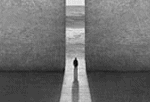
5- Midnight Tides. That scene at the sea, where the massive thing comes out out the water. Something inspired to the third picture you see here. Scene again based on wide scale, slightly tilted for dynamism. Camera from the land looking out at the sea. Looking like something straight out of the apocalypse.
