HA! I’ve got this one in Italy one day BEFORE official US release. Take that, and blame Amazon Europe that didn’t respect the date (and if you are in Germany they got a really low price). Usually it takes me at least one week past release to get a book.
Anyway, while I’m not a big Sanderson fan and this isn’t exactly my preferred reading, I’m still very glad of getting this book and happy to start reading it right away (at my pace). It’s been three years and a few months after The Way of Kings. Maybe I could have planned my reading queue better since right now I was focusing mostly on The Shadow Rising and I consider Sanderson and Jordan relatively similar, in that both are fairly light and leisure kind of reading, but I’ll stick with it.
This Stormlight Archive series is a big investment for Tor, in this age post-Jordan, and you could have seen it concretely in the first book. It wasn’t just a way to deliver words on a page to you, but a rather nice package that had been very carefully built to draw attention and do the best service possible to the words it contained. They wanted this book not a book, but an event.
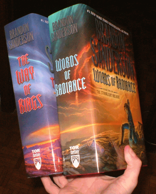
First, it got Sanderson’s favorite artist for the cover, Michael Whelan, who actually made a really good cover, with warm and strong basic colors and an evocative scene that let transpire the book’s aspired breadth and epic range. It celebrated the scenery more than it celebrated some chosen hero. It then had a bluish hard cover with a sword-like symbol impressed on the front, and a nice texture. Then you flipped the page and there were two gorgeously colored illustrations, one with a map of the regions of the world, the other with a Tree of Life wannabe diagram with fancy symbols. Again the two full-color illustrations mirrored on the back cover, one showing some spiritual equivalent of the map, the other a variation on the Tree of Life theme (and my disappointment was that absolutely none of this was introduced or even glimpsed in the actual text). Than a two-pages acknowledgements by Sanderson telling you how this wasn’t just another book he wrote, but actually the apex of his ambition, the one true project he was really investing himself into. So up the hype.
Then you got an index. And you could see that Sanderson was using every single permutation that he had available. Fantasy books indulge with structure-related artifices, like quotes or poetry to start a chapter, frontispieces, prologues and epilogues, maps. Sanderson took everything (almost, he’s missing family trees and Dramatis Personae). He had a Prelude, sub-division into Five Parts, Prologue, three Interludes (which I enjoyed the most out of everything else in the book), an Epilogue, Endnotes and even a quick & dirty Appendix. And then he took also quotes at the beginning of each chapter, and illustrated chapter headers. But not like WoT chapters headers, with a symbol to represent the chapter. Nope, he had an arc-like thing whose sculpted faces changes as the chapters change AND an illustration within a circle to better represent the theme. And then he got illustrations. Actually good and sometimes useful illustrations. Nineteen of them. Some of which artsy, inspiring maps of cities or other regions.
So the book was overflowing with presentation-driven aids and embellishments. It wanted to make this book more than a book, an experience. It wanted to seduce you with words and colors and art. Because that’s the point: ten of these 1000 pages volumes are planned by Sanderson for this series (without even considering a wider structure to which this series is supposed to belong to). He wants you with him for the long haul. This is his, and Tor, contemporary Wheel of Time, and this time, instead of being found by success, they are planning for it. Planning big, all in.
I can at least enjoy and empathize a little bit with this hype. It doesn’t hurt and I always admire and appreciate ambition. So if I can breath some of that hype it just adds to the experience and makes me actually excited to read the book without overthinking that in the end it’s average fantasy, really. At that point the writing itself is alone to prove itself, but up to that point the presentation made sure to put the writing in the best position possible.
So the point now is: has Tor weakened its effort and marketing push in regards to this second volume? The answer: it’s about the same.
I was worried that after the big splash we’d instead get far less commitment for this second volume, but instead Tor at least made the fist volume into a canon. So this second volume is a very precise copy of what we got with the first, with maybe slightly less love overall. The new cover is rather underwhelming, and nowhere comparable with the one used for the first volume. The chosen hero is now featured prominently on the cover, in a rather cheesy pose/act. The environment is dull, the colors a sickly and drab yellow palette. It seems more like a cover for Peter Pan. The scene has none of the depth of the one in the first volume, and the lance that the character is holding could have at least given the cover some dynamism, but it’s completely obscured by the title. So a mediocre cover overall (if you told me it was made by some dude imitating Whelan’s style I’d believe it). But it retains the style and artist, so it’s the artist in this case who failed to deliver. The book itself is instead red, with a nice silk-like texture to it and another symbol/glyph engraved in the front, different but in the same style of the one in the first volume. You flip the page, but the illustrations with map+Tree of Life are gone. We get instead a two-page illustration by Whelan again with Shallan on a rock, and it’s actually far, far better than the illustration on the cover, whoever chose that one over this is a total fool. On the back cover instead we get a two pages color illustration of the map. Which is basically the same map that you get in black and white within the book. So overall the four gorgeous illustrations in The Way of Kings don’t have an equivalent parallel in Words of Radiance, sadly. A bit of slack.
The inside instead follows closely the first volume. We’ve got again Acknowledgements by Sanderson, this time two pages and half, but only because they greatly embiggened the font. Sanderson again pushes on the hype with this book that is not just a book, and also explains that writing a book is becoming a thing of teamwork, with various “consultants” to help with specific aspects of the writing, like continuity, character psychology and horse behaviors. Then the usual Index listing the exact number of illustrations that were in the first volume, and a similar smattering of Prologue/Interludes/Epilogue. Interestingly, The Way of Kings played with part two and four subtitles: “The Illuminating Storms” and “Storm’s Illumination”. Words of Radiance does something similar with parts two and five: Winds’ Approach” and “Winds Alight”, but where ‘approach’ and ‘alight’ are titles of respective parts. The illustrations appear on a individual basis less cared for compared to the first book, somewhat more perfunctory. Everything else follows the model of the first book. Thankfully We get the exact same font, size, lines on each page. The official wordcount for The Way of Kings was 387k for 1001 pages. Words of Radiance has 1080 pages, and even if I didn’t manage to get a wordcount from Sanderson & assistant, we’re likely around 405-410k since everything is the same, including the wide margins on the page. In the end 400k make for a REALLY long book, but conventionally so. There’s nothing extraordinary about that.
So overall the quality of Words of Radiance, when it comes to the package & presentation, is slightly below the level of the first book, but thankfully Tor maintained the exact same, already lofty, standard. I’m very glad they are sticking to the format, and I roll my eyes thinking that most surely at some point in the life of this series will come an overzealous editor that will start playing with font sizes, pagination and overall layout just to ruin the consistence you expect. Because it always happens.
But for now the two books are a perfect match, and look great side by side.